How To Make Art With Strava
Whether you want to call it run art, route art or StravaArt, drawing a picture or spelling a word or phrase from the route captured by your GPS watch or smartphone app while you walk, run or bike is easy (and fun!) If you never practiced the art–or want to learn how to do it yourself–I am going to fill you in on all the nitty-gritty details. To keep things simple, I will limit my discussion to running, and will refer to the practice as run-art.
Once or twice a year before the COVID pandemic, I led a run for PPTC with the goal of spelling some word or drawing something related to the theme of the run, such as a phrase for Valentine’s Day, or a menorah for the Hanukkah holiday. There is not that much difference between drawing pictures and spelling words, but let’s just stick to spelling.
My “canvas” is a city grid, where there are street signs at most corners for reference. I am a city person and do all my run-artwork in the city. Out in the ‘burbs, things are very different. I won’t get into that, but you can contact me if you want to learn how to draw art where you live.
If you already track your runs with a watch or some app, you are already equipped to do run-art. Years ago I started with a Garmin watch, but lately I rely solely on RunKeeper or Strava on my iPhone. I recommend an app, something that allows you to see your progress as you make each letter. I don’t know if Fitbit and other devices would work, but anything that can produce a map of your workout can turn you into a run-artist (which is a lot of fun to share with friends and fans on social media and get feedback on it).
While there are apps that let you design the route turn by turn–just like driving a car–I am fine without such apps. For my own runs, I plan ahead by designing a route in Google Maps. It’s actually very important to plan ahead: Most of my runs are on a rectangular city grid, but hospitals, cemeteries, or school campuses span more than a city block. I need to know where I can and cannot run, and design the route around such obstacles.
Depending on what you want to “write,” you may not have enough city blocks to lay out your letters going across.

How to make the letter “c”
Some helpful tips:

How to make the letter “b”
Start with just “abc,” one letter at a time per run. Make the letter “c” then end the run on your watch; start a new run with “b”, and so on. Recall that we are working with a city grid, so make the letters one block wide and two blocks tall for “a” and “c.” “B” needs to be four blocks tall to accommodate the left side.
Note that I suggested starting with “c”, then “b” and finally, “a”. That’s because “c” is relatively easy to make. You may end up making it too blocky, but at least it is more straightforward than “b” or “a”. Start at the upper right, go left then turn left at the first corner, keep going for two blocks then turn left again, go to the corner and end the run.
“B” is not that difficult either. Let’s say you start at the lower left of the “b”, head right, then turn left at the first corner, go two more blocks then another left, more block toward where you started then another left and keep going until you get to where you really started. That’s just an “o”, of course, so now you need to go four blocks “up” to make the back of the “b”. Since you are making a single letter, you can end the run when you reach the top of the “b”.
The easiest way to write the “a” is as a small “o”, with an overhang on the top. Starting at lower left, head right then keep making the left turn for every single block until you are back to where you started. Head out right again but this time as you head “up” skip the first block, and turn left at the end of the second block. Head left and turn a little bit to the left then end the run.

How to make the letter “a”
That’s it! You wrote “abc”, or “cba” to be exact, one letter at a time. You will not win any run-art contest just yet, but it’s a good start!
Before we go on with making an actual word, take a look at something I made that perfectly illustrate the way the letter “a” should be made in a phrase. The place is called Marine Park, but because I didn’t use the “a” with the overhang, it looks more like Marine Pork! 🐷

Likewise, the “r” should be written like that in “Marine.” Doesn’t the “r” in “Park” resemble an “n”? Other words that have preferred writing methods are “s” and “z”. See my rendition of the word “Johnson” below. I mistakenly made the “s” the way some people write on paper. Doesn’t it look too much like an “n” as well?

This method of making the “s” requires slanted lines on the two sides, something not easily done with a rectangular grid, unless you plan your writing on some city block that matches that shape. Again, look at a computer screen, whether your laptop or your smartphone, to see how the letter “s” should be made. Likewise, “z” should be made as seen on a computer screen, not like that when written by hand, which has a part that goes down below, not unlike a “g”. (By the way: “Marine Park” is actually composed of two separate runs. I combined the words in Photoshop, which you can do as well).

The word “run” on a map
Now that you’ve seen some examples of my “writing,” let’s make a simple word!
The word is “run” in lowercase, with each letter one block wide and one block high. Connect the letters at the bottom and leave a space of one block between each letter. I am including a route below, but without the arrows to tell you which way to run.
My method is to start at the base line, so start at the bottom of the “r” and run to its top. Note that the letters are now less blocky. Very often when people do run-arts, they turn the corner at the very last point, resulting in a 90-degree corner. In my book, this is a no-no! I prefer round corners, as curvy as possible.
Let’s use the letter “r” as an example. It is composed of two lines, one that goes along its height then a curvy one at the top. As I run up along the “r”, I run on the left side of the street, the far side of the letter, if you will. I would run all the way to the corner but then turn 180 degrees around and stop at about three cars’ length from the corner. I would begin to cross the street, not directly across but at an angle, say 45 degrees toward where I am heading. At the corner, I hug the curve as much as possible, not unlike how when you run in a race you want to run the tangent so you don’t have to run more than necessary.
At times I even take advantage of people’s lawns (if the lawn already looks shabby, that is)! Or even a driveway if one is available. I also take advantage of the street’s width to introduce more curves into the letter by crossing the street at an angle. Three cars’ length away from the corner, I cross the street at an angle and hug the curve just like before, round the corner, temporarily stop at three cars’ length. I am done with the letter “r” but since I prefer connecting the letters along the baseline, I have to trace my way back almost the same way I came. I say “almost,” because there is no need to re-trace the entire straight line that forms the backbone of “r”, just the curve at the top and then back down to the beginning.
As my drawing shows, the “u” and the “n” also have curves, just apply the same principle of making the most of the street’s width and the street corners. The letter “u” is an extra tedious letter to draw since you have to run up and down its length twice, once for each side of the letter.
You should notice that you covered a shorter distance when making “run,” as opposed to making the three letters “c”, “b”, and “a”. Recall that “a” etc were made with a height of at least two blocks. “B” itself was four blocks tall. Although I can run long distances in making run-arts, I prefer to be economical with my execution, both with the number of street blocks available and in terms of time. From time to time I would see some news story about a runner making some really intricate drawing, but the run would cover a marathon distance or more. Maybe the runner was fast and it would take him four hours. At my speed, assuming I have the time to allocate to the run, that would be like seven hours or more.
Most of my run-art runs cover about four miles, and take maybe two hours, tops. Using my criteria of letters being mostly one block wide and one block high (“1x1”), my words normally stretch out over maybe ten blocks.
If I were to make letters two blocks wide by two blocks high, more for capital letters or those with ascending lines (like “b”) or descending lines (like “g”), I may not have enough rectangular blocks to work with.
Working with letters 1x1 has its own challenge, as we will see when we try to spell “eat run love”. Don’t you enjoy eating? That’s why you run, right? To justify your eating habit! Not a good thing in excess, but it’s so enjoyable.
What about “love”? Love whatever you like, I just like to introduce the letter “v” into our exercise.
Start at the bottom of the “e”, right side, where the little “kick” ends. Apply your new-founded skill of rounding the corner and run clockwise (with respect to the map) until you are back on the street where you started, right where that perfectly straight line that somehow travers the city block.
Long before virtual classrooms and virtual meetings, I already discovered virtual trespassing, with the help of Strava app or Garmin GPS watch. So we know that if you run around the block with your watch recording the route, you will end up with a rectangle, or ellipse if you applied my advice of making curvy corners.
Still using our example of running clockwise around the block, what if as you are three quarters of the way done with the enclosed shape you press PAUSE, however such action is done, run back to the other side of the block, and take your device off PAUSE mode? The little computer that controls your device knows that just before the pause you were on the other side of the block. It knows nothing about how you get to this side of the block when the unpause happened. The shortest line between two points is a straight line, math is true like that whether you are a computer or a human being, so a straight line is drawn between the two locations.
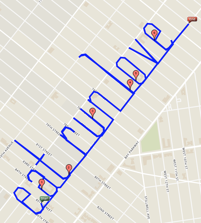
Voila, a line cutting through the city block, without having to actually climb over any house’s fence. That’s how the “e” was made, likewise for the “a” and the “v”. Note that I used one block to separate the letters of a word but two blocks to separate the words. At the end, I go an extra two blocks out before stopping the run. I capture my run-arts using screenshot utilities. The screen itself would have Start Point and End Point, those graphic elements may be too large and cover part of the route. For “eat run love”, since I end at two blocks past “love”, if needed I can crop out the End Point. The Start Point may be an issue so if you want to you can start two blocks to the left of “eat”, if applicable.
That’s all there is to run-art, as envisioned by me. Start with 1x2 letters on rectangular city blocks just to get your sense of direction going. Apply the idea of making curvy corners to make the letters more attractive, to me at least. Also try to make the letters unambiguous, by making the “a”, “r”, and “s” as they appear on computer screens. Next advance to making simple 1x1 letters that don’t require you to cut through a city block. Finally, experiment with the PAUSE function of your device to take you to a whole new level of run-arts.
----------------------------------------------------
Text and images: Linus Ly
Edited by: Alison Kotch
Produced by: Alison Kotch